Hand In Hand KC Audit
Narrative
Introduction to Hand In Hand KC
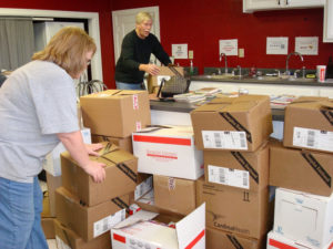
Hand In Hand KC is a nonprofit organization created in 1996, located in Kansas City, Kansas. The organization is dedicated to providing holiday gifts to families with children who would not otherwise have the opportunity and ability to have such gifts. The organization is run completely by volunteers who work with professionals in the field to determine what children are in need and what they need. 100% of donations go directly to these families.
One key factor that stands out about this organization is that the gifts given to these children are done so discretely. Children believe they came from their parents rather than the organization. They also make application easy so that as many people that need help are able to get that help. However, the applicants are provided by professionals who work with these individuals to ensure they are in need.
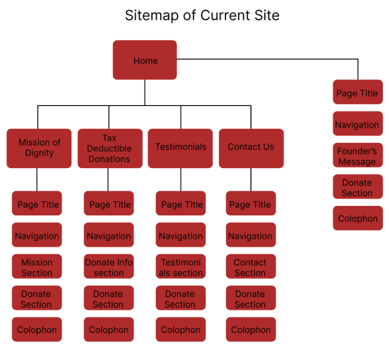
Hand In Hand KC Website Overview
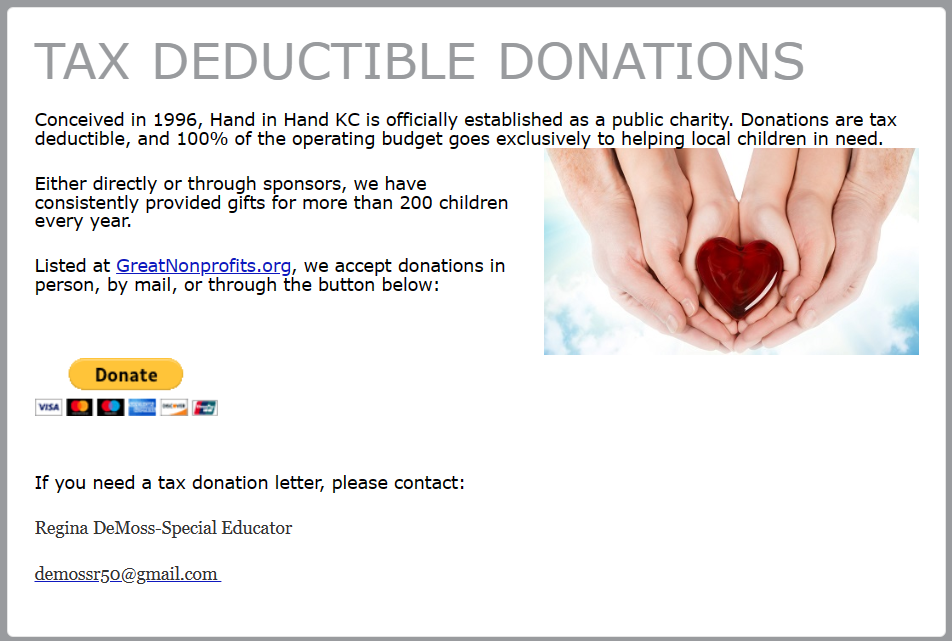
Original Hand In Hand KC WebsiteThe Hand In Hand KC Website is a very basic, simplistic website. It is limited in size and content, with the main purpose being to gather donations. The organization provides information such as a description of what they do, who they are, how they were established, and their impact on the community as shown through testimonial evidence. It also provides a method of communication for further questions or requests. The main elements of the website include the five pages; the navigation menu; sections of content with headings, paragraph text, and images, a form, text links, and buttons.
While the website has a good foundation, it definitely could be improved upon.
Hand In Hand KC Website Positives
Positive aspects of the website include the fact that the purpose is fairly clear. The content all seems to relate to the organization and site’s purpose and there does not seem to be an unnecessarily large amount of content. Having the call to action on all pages is an important inclusion.
Another beneficial component is the existence of styles used across the site. These most often remain consistent. They also reflect the styles of the brand of the organization such as the logo.
All elements seem to be functional. And the site does resize according to the viewport size. While this responsiveness is not optimized, it is a start. For example, most of the site content is resized to better fit in the viewport, and the navigation changes to a hamburger menu on mobile. In addition to functionality, the site also is easily navigable as the structure of the navigation is fairly clear.
Hand in Hand KC Website Negatives
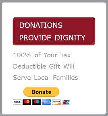
The site does not do well to stand out and bring attention to important elements, primarily the call to action of donating. This is likely due to the lack of color, simple fonts and images, sizing location of certain elements, and a lack of change to show interactions. For example, in smaller viewports, the donate call to action is moved to the bottom of the page. Another example is the location of the logo being unexpected rather than being in the top left as typical.
Another issue is the organization of the content. The information could be better consolidated and rearranged to make better sense. Headings could also be given clearer titles to help in this area.
There is one particular instance of a style inconsistency that may confuse viewers as well that should be changed. The text “DONATIONS PROVIDE DIGNITY” in the donate section is styled the same as the buttons on the site.
Readability may also become an issue. The subheading at the top of the page overlaps, the spacing between letters and lines in paragraphs is not significant enough, text wraps strangely around other elements such as images, and there is little separation between text and other media elements.
Much of this is connected to the responsiveness of the site. When the viewport changes size, elements do not wrap well. This includes text, images, and navigation buttons, particularly on medium-sized viewports. Text overlaps even more significantly. Element sizes adjust, but they change to sizes that may be considered unappealing or confusing.
On the mobile version, there is a drop-down menu, however, the hamburger menu for this menu is not in the expected location. It is on the left rather than the right. A prevalent issue with resizing is apparent in this version as well. This being the overwhelmingly large size of headings in comparison to the size of other text elements.
Hand In Hand KC Website Conclusion
The website is at a good starting position Making adjustments based on the issues listed above should improve user experience and encourage more users to get involved with the organization.
Hand In Hand Interface Inventory
Logo

Navigation/Navigation Buttons

Sectioning
Headings


Buttons


Links


Form Inputs


Paragraphs
Error Messages


Images


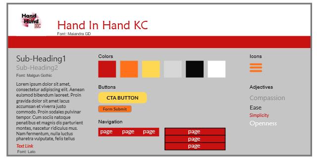
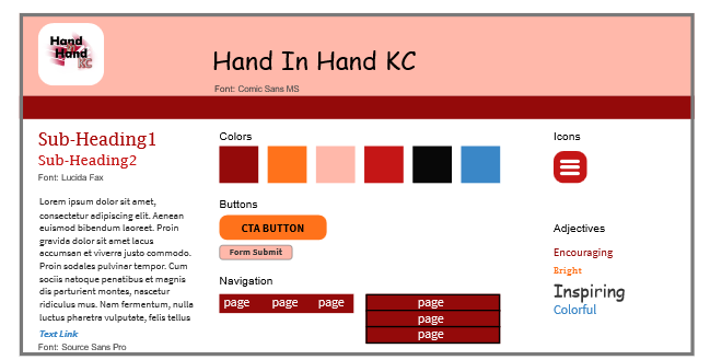
Style Tiles
Design Brief
Brief
For the Hand in Hand KC website redesign, I have decided to focus on making the brand stand out, prioritizing calls to action, reorganizing/rearranging and retitling content, adjusting navigation to ensure a user knows their location on the site, and adjusting the responsive elements on the site to improve proportions and spacing. This should help improve user experience and encourage user engagement by fixing issues with readability, navigation, and lack of user interaction/interest.
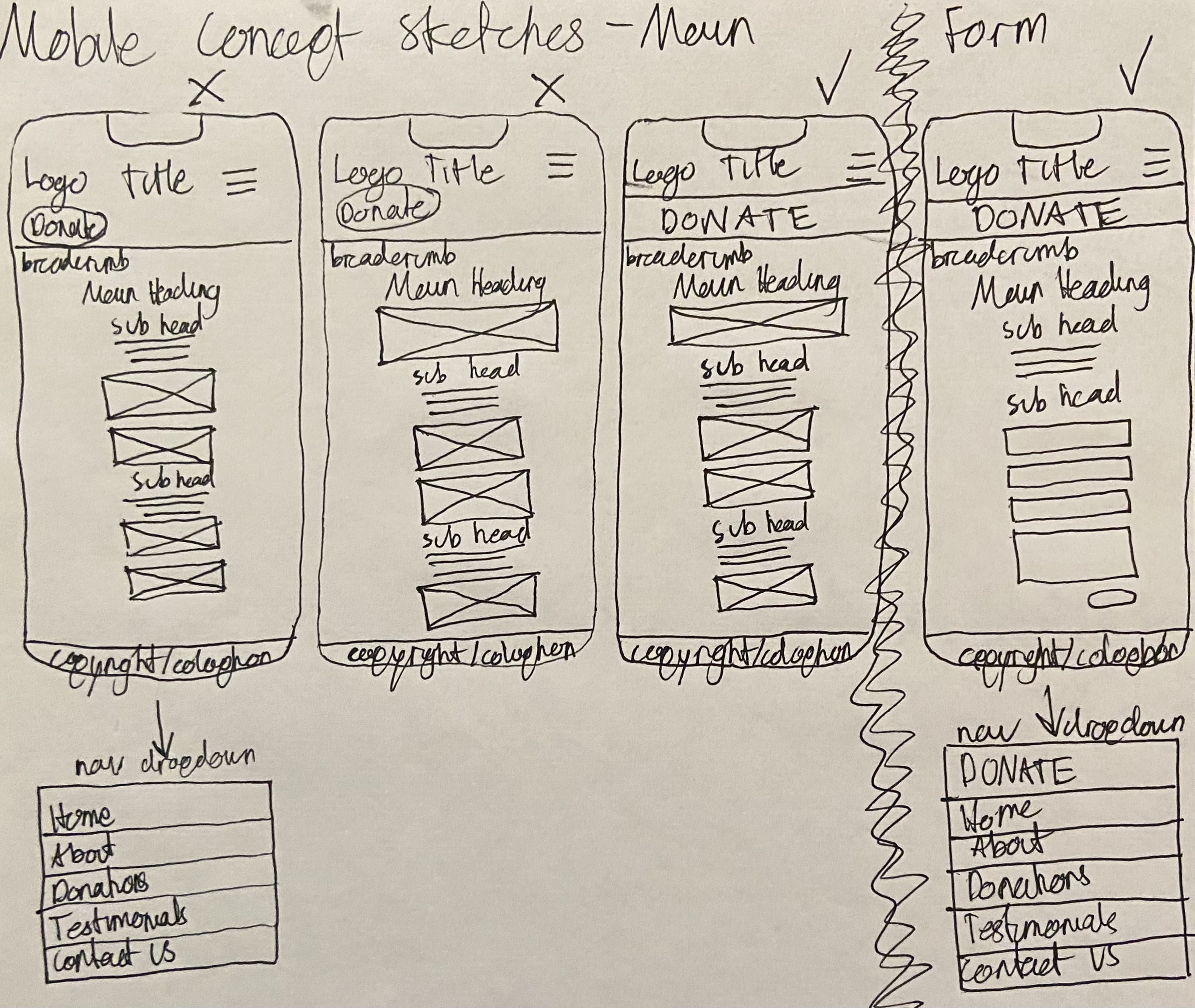
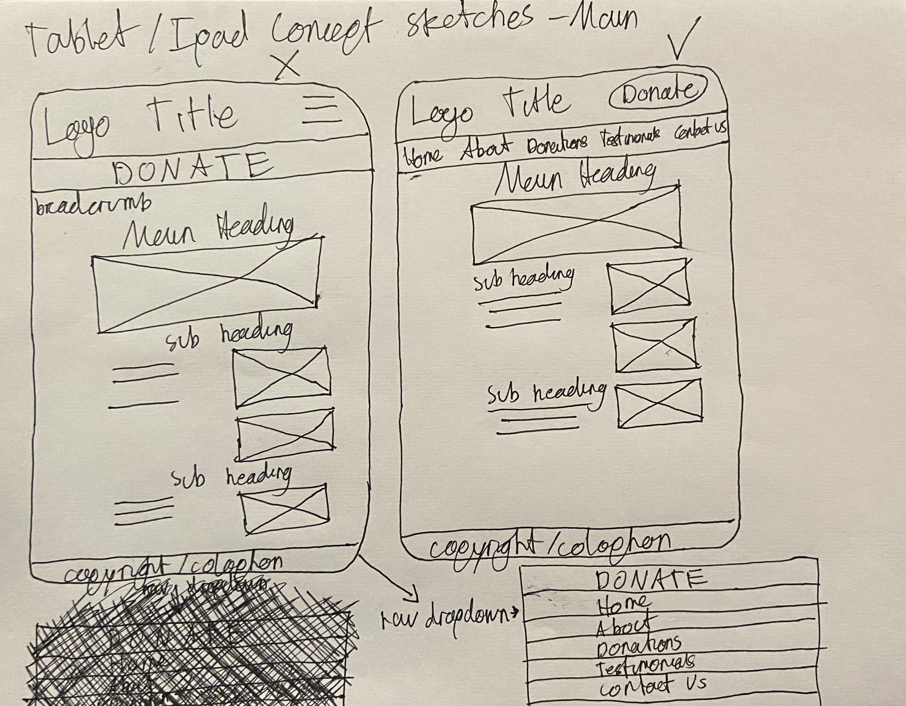
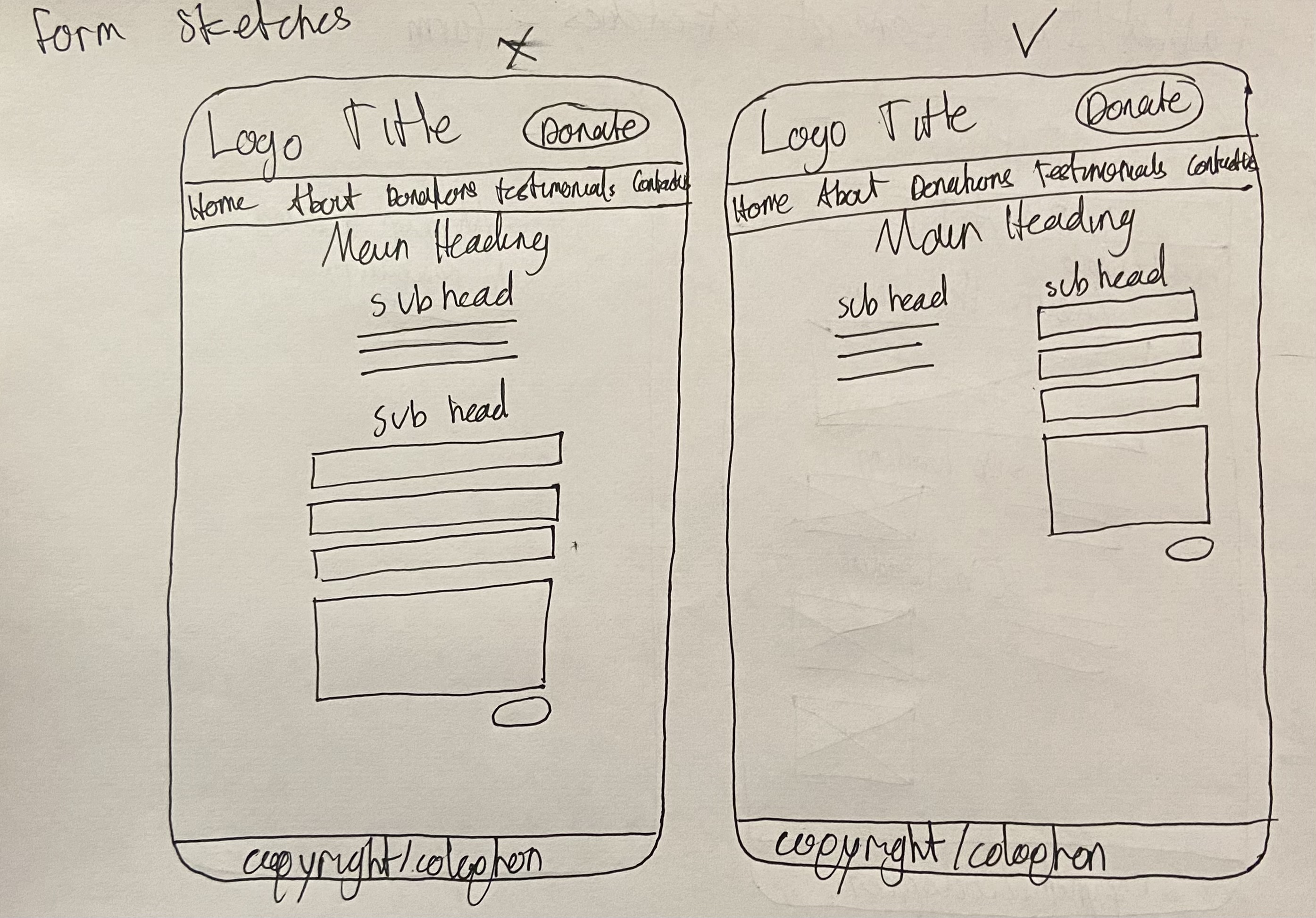
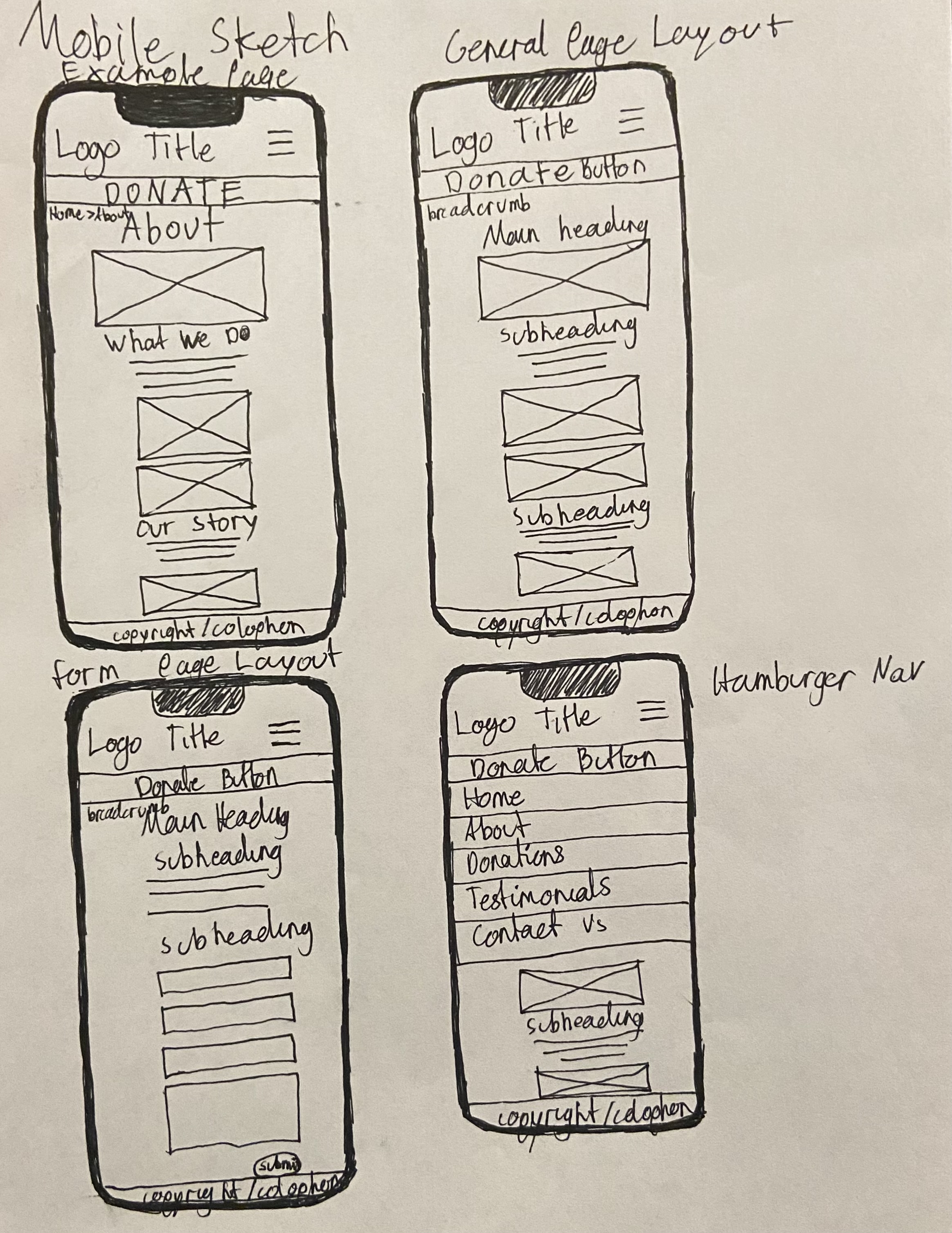
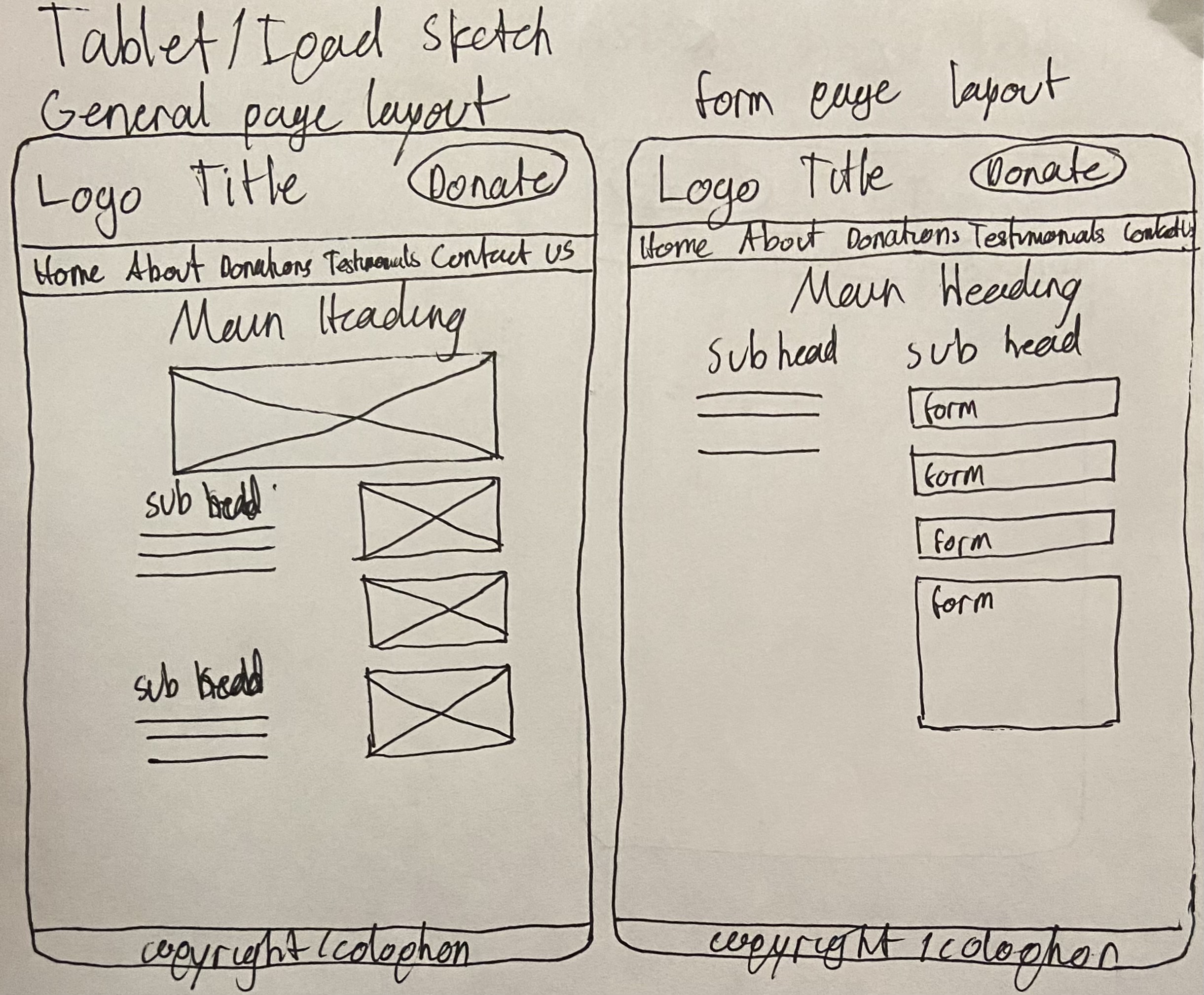
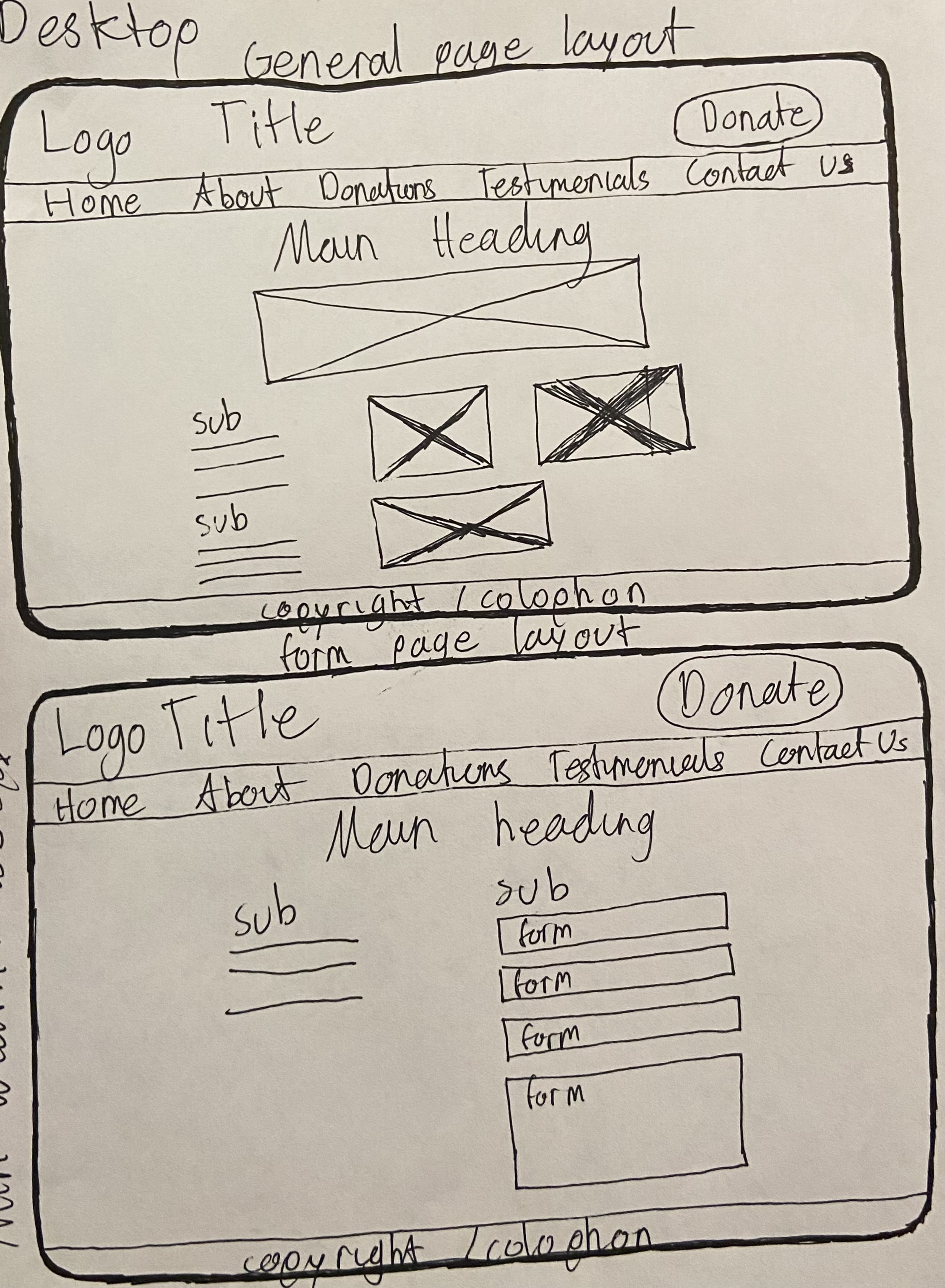
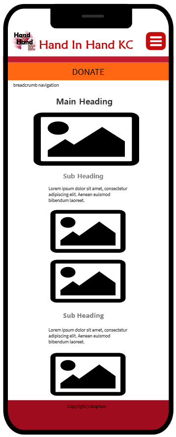
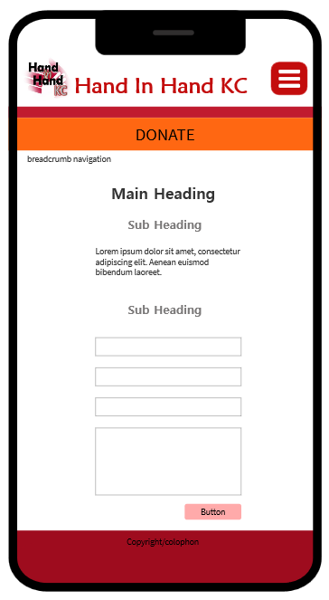
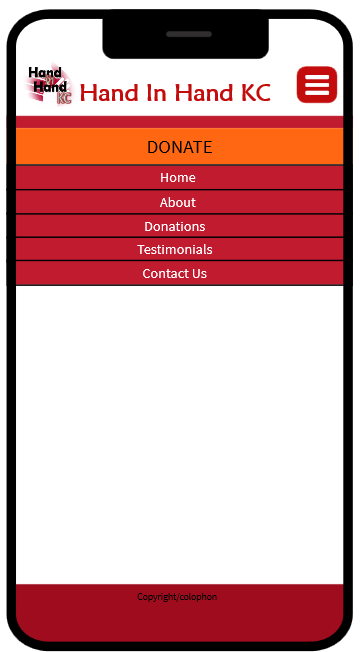
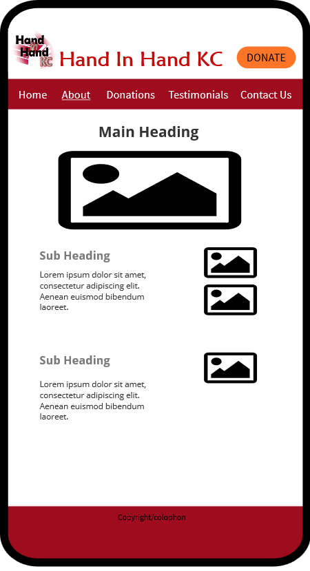
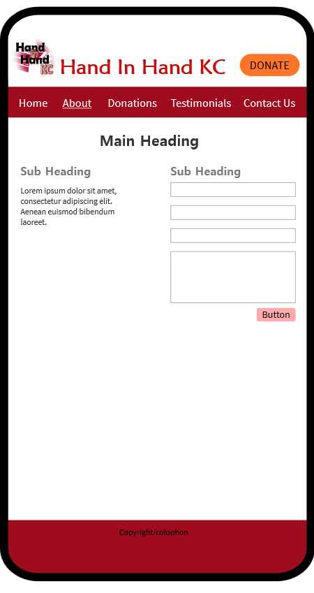
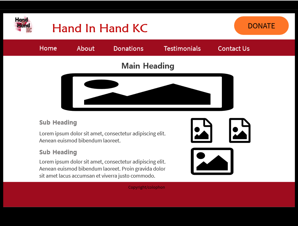
I plan on consolidating and simplifying much of the content on the site as well as rearranging the layout according to the viewport size. For example, the mobile version will have a single-column layout, the tablet version will have a two-column layout, and the desktop version will have a three-column layout. The mobile navigation will also be a vertical dropdown menu while the navigation for tablet and desktop will be horizontal.
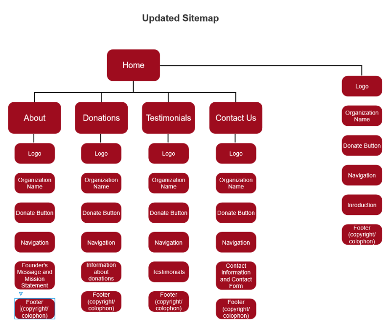
I am choosing to retitle the pages as Home, About, Donations, Testimonials, and Contact Us. I will switch out some of the content from the Home and About pages as this content should be arranged to better fit under the new categories.
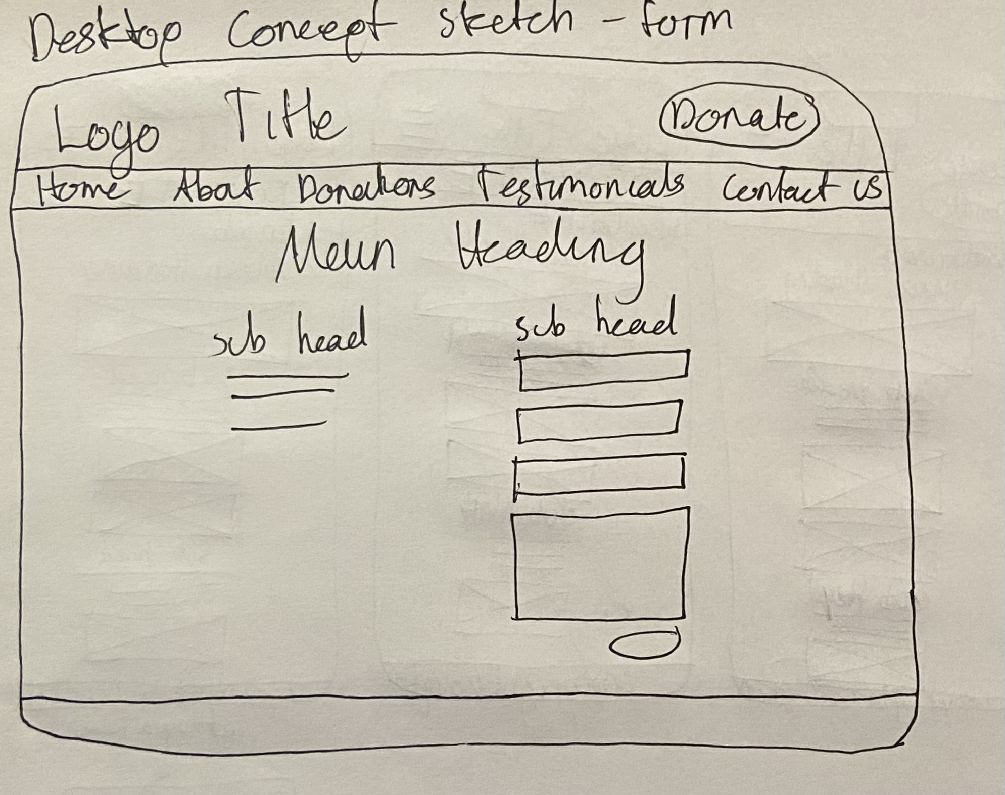
I plan to create basic templates for each viewport size, one that defines the layout of a typical page with text and images and one that defines the layout of a page with a form element.
Concept Sketches
Mobile Concept Sketches (width of up to 768px)
Tablet Concept Sketches (width from 768px to 1024px)
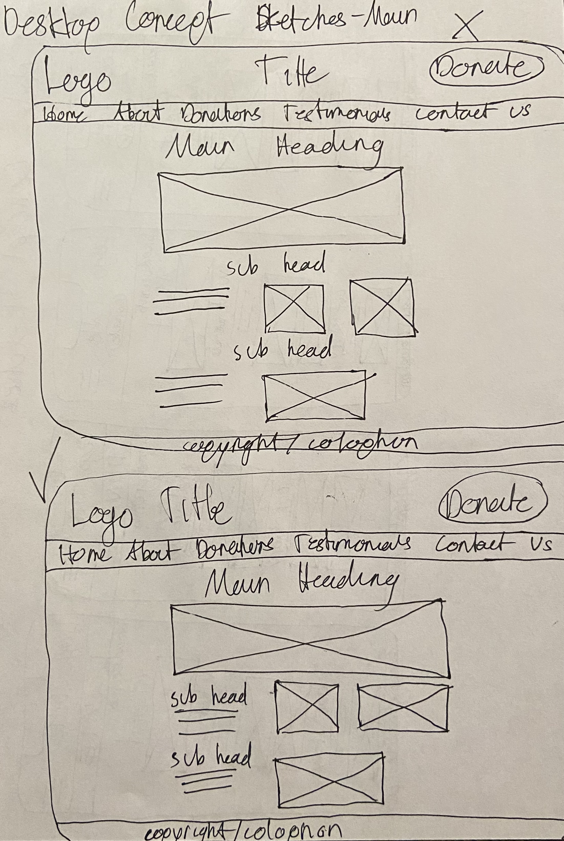
Desktop Concept Sketches (width of 1024px and up)
Formal Sketches
Mobile Formal Sketches (width of up to 768px)
Tablet Formal Sketches (width from 768px to 1024px)
Desktop Formal Sketches (width of 1024px and up)
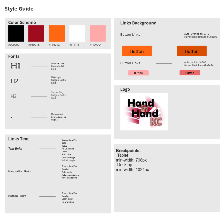
Style Guide
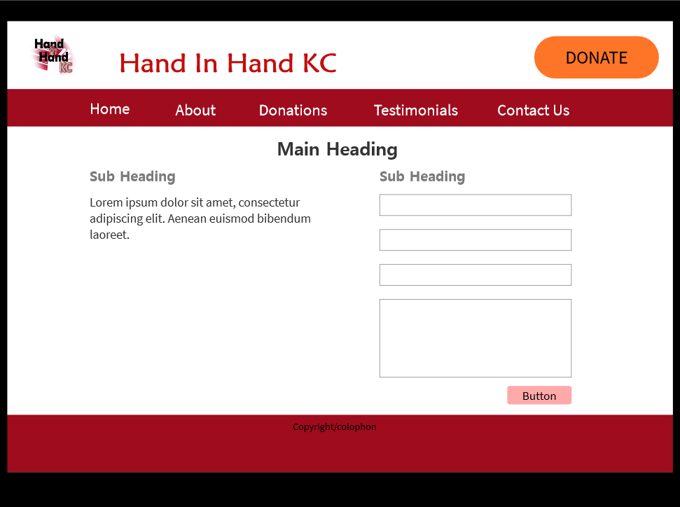
Mockups
Mobile Mockups (width of up to 768px)
Tablet Mockups (width from 768px to 1024px)
Desktop Mockups (width of 1024px and up)
conclusion
Why Hand In Hand KC
I chose to redesign the Hand In Hand KC website for several reasons. First of all, I like the work that the organization does and its policies. I also like the people at Hand In Hand KC's unique perspective regarding charity work, specifically prioritizing dignity. Another reason I chose this website to redesign is because I saw potential and possibilities for change. In addition, the website, although basic, has a fairly solid and coherent foundation.
Improvement in Redesign
My redesign of the site focused on memorability, usability, responsiveness, and overall appeal of the website. By redesigning the site, I improved the organization of content to be more logical, I changed styles to add visual interest and draw users in, and I emphasized important elements and calls to action to encourage users to participate and interact with the site and organization.
sources
CDN Fonts
Coppersmith
Dreamstime
Pxhere
Eastover Dental Clinic
Pexels